Visual Identity for Kennedy Learning Lab + Educational Consulting
Over the past couple of year’s I’ve gotten to know Tim, founder of Kennedy Learning Lab and Educational Consulting, at the Peoria Open Coffee Club. (Highly recommend networking, by the way!)
When he came to me with his vision for this new operation, he explained that school boards and principals are the ones with the buying power, yet he works directly with teachers, students, and parents. The complexity of the ideal customer and who to attract with this visual identity was no small thing. Not only that, but there would be two arms to the company — a learning lab for students to get extra help and an educational consulting side to aid and train teachers and staff.
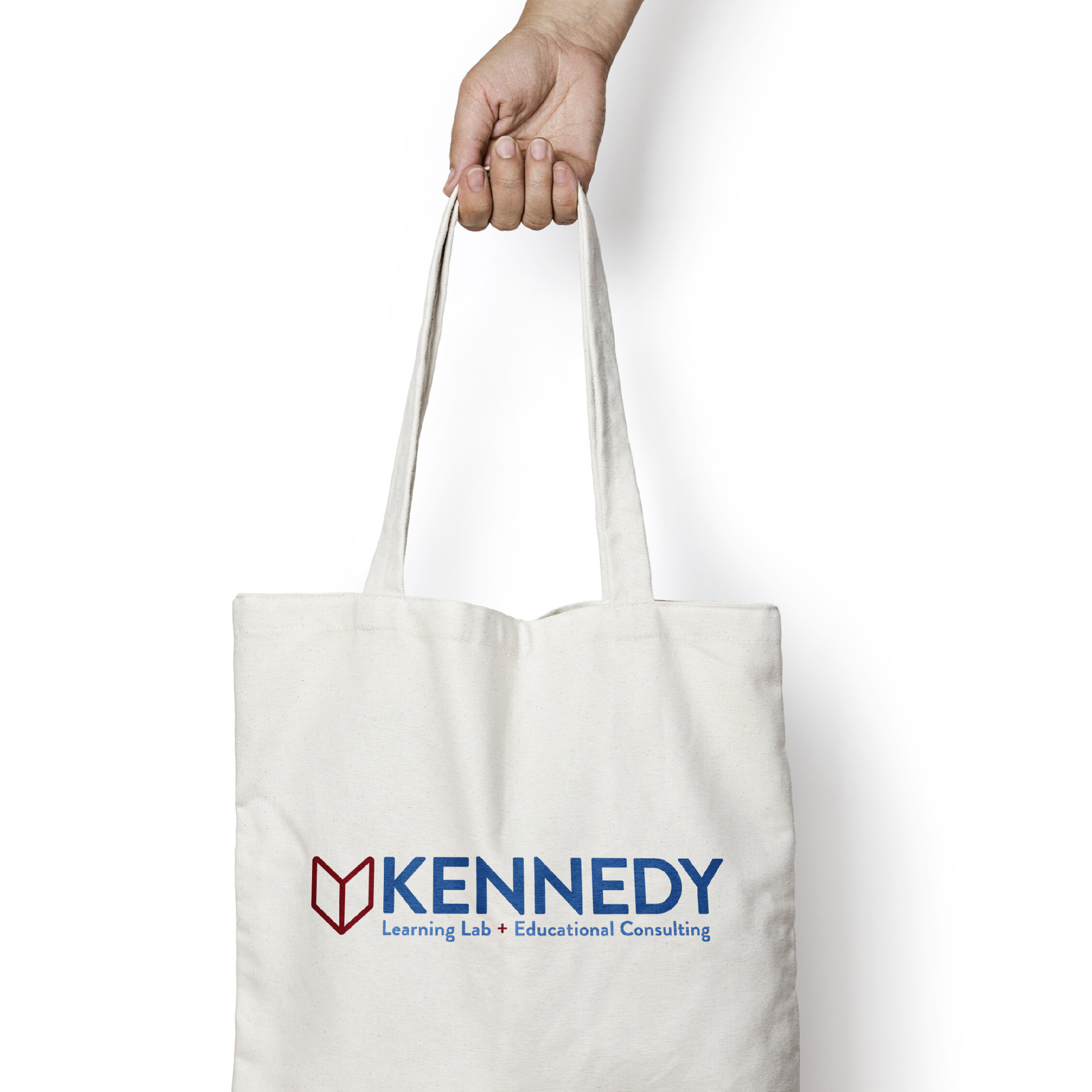
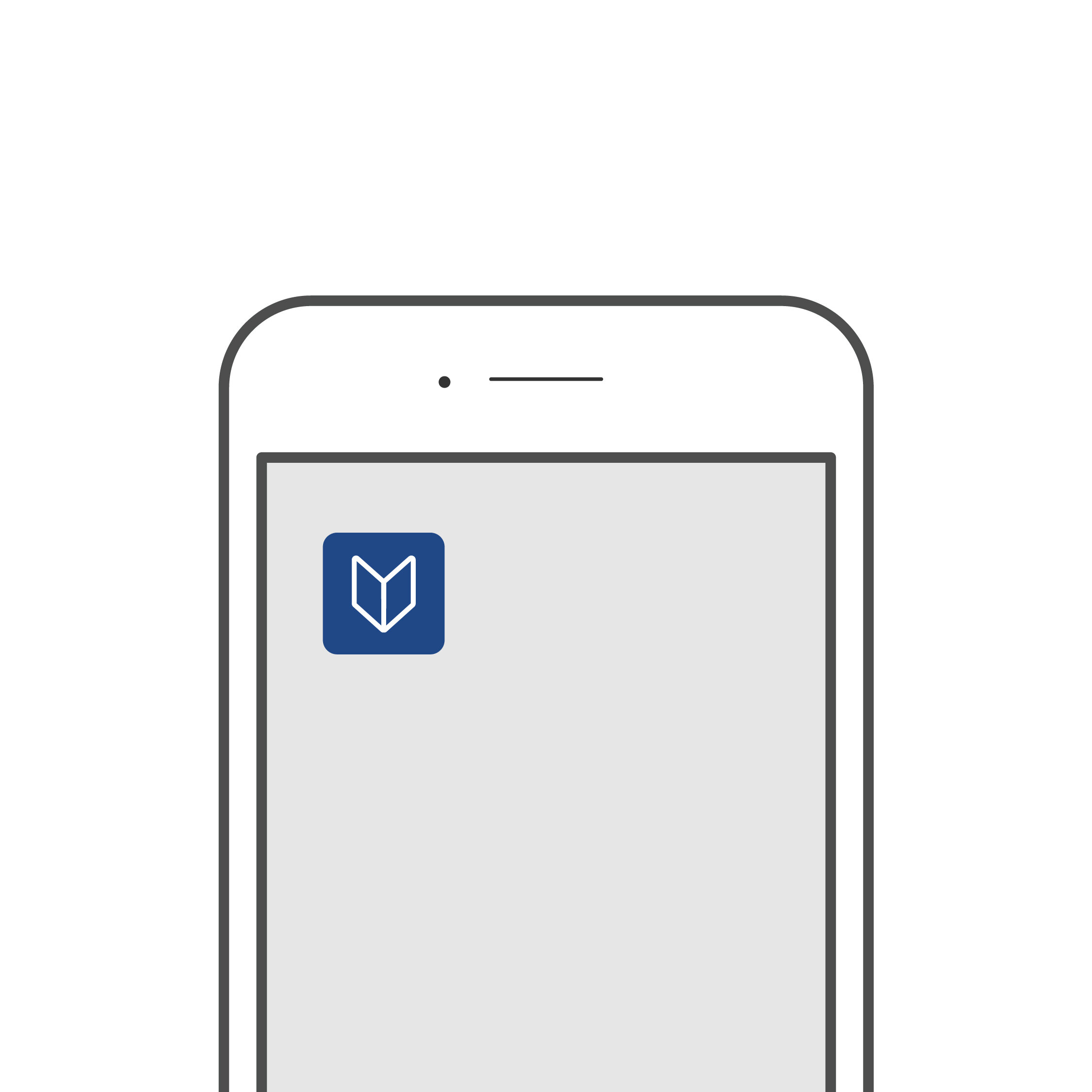
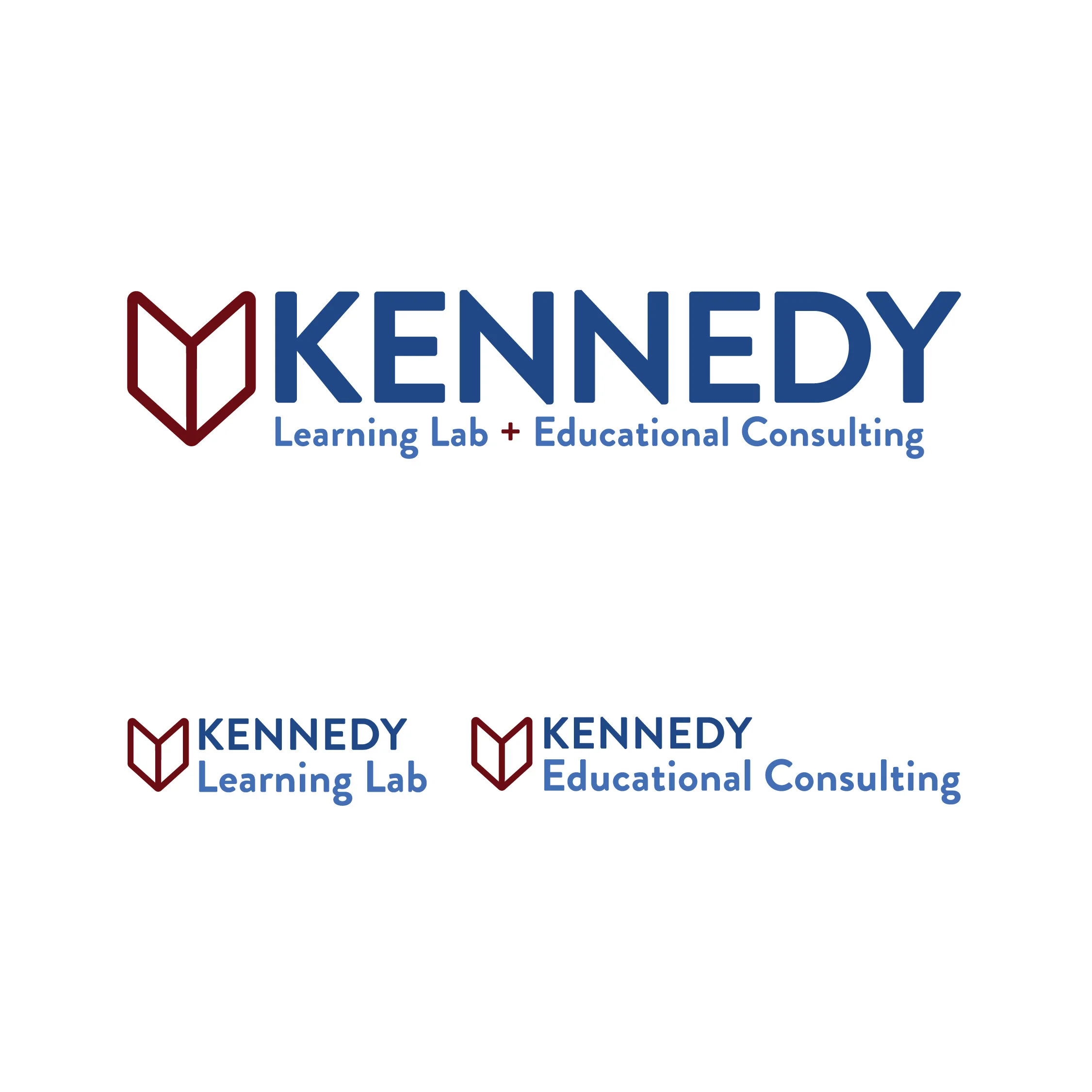
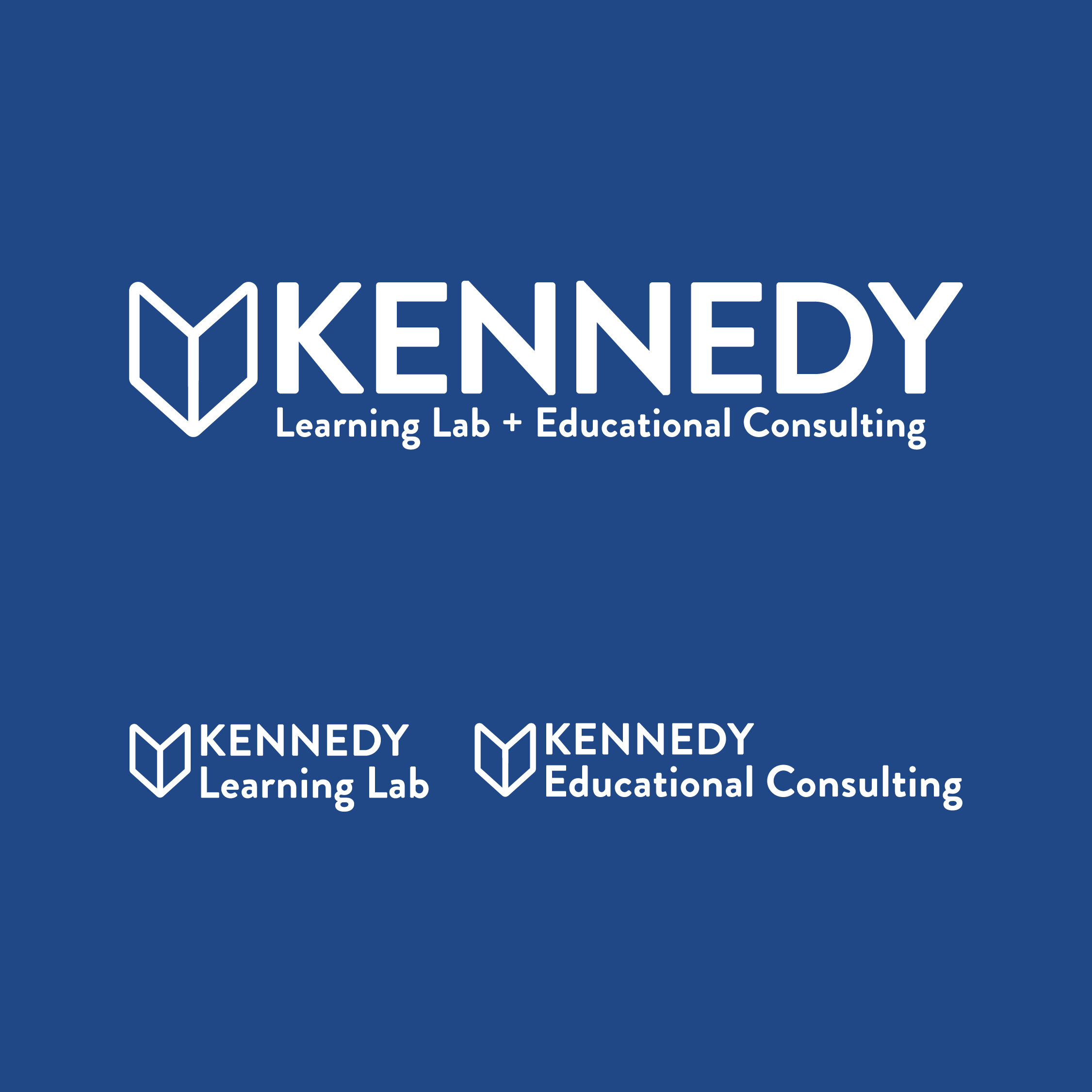
Thus we created a main logo, two sub logos, and an icon that can be used for social media or on an app. Because I knew that the long term plans included an app, it was important that I create a logo that is icon driven and will be simple and clear enough to view on a half inch square. The book icon, representing learning and reading, is derived from the same angles as the “K” in Kennedy and is connected to the “+” (and AND math symbol) by color. Additionally, we made sure that the color matrix would be professional, yet bright and fun, in order to be relevant and attractive to all customers.
By providing Kennedy Learning Lab and Educational Consulting with a variety of assets that will grow and transition with the business, I believe they’re positioned for long term success and I am cheering them on as Tim and company builds their business!
You want your brand to stand out from the crowd. I’m here to help make that happen! Kayla Phillips Design is client-centric design studio built to take the guesswork out of executing projects that will bring clarity to your offerings, attract your ideal customer, and increase your revenue. Is your brand blending in? Reach out to stand out today.


